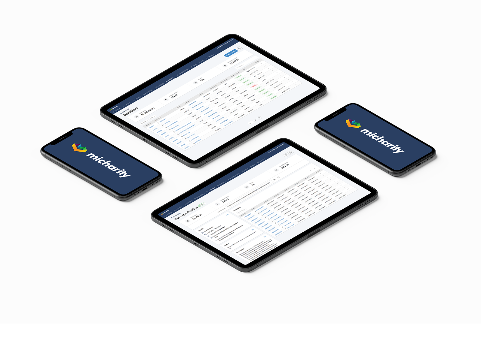

Micharity is an online fundraising software for charities and nonprofits. The CRM aims to provide an all-in-one solution for managing everyday operations with tools donation forms, campaign management, donor CRMs, report generators, email marketing and much more to streamline the everyday operations of its users.
My role as lead UX/UI designer was to update the look and feel of the platform to make it feel more intuitive, user-friendly and modern, as well as implement new features determined by research on user needs.
Due to the NDA agreement I am unable to show all the steps in the design process, only the finished product.
The typical users of the Micharity software are administrative assistants at a non-profits or charities. The demographic is older and less comfortable with technology.
The challenge was to redesign the platform to be more user-friendly, intuitive, visually appealing and effective for our customers.
After interviewing several long-time users, we discovered the main pain points were:
- UI elements were outdated, unappealing and cumbersome to use.
- Information was difficult to find at a glance due to lack of visual hierarchy and poor design.
- The workflow was redundant and inefficient.


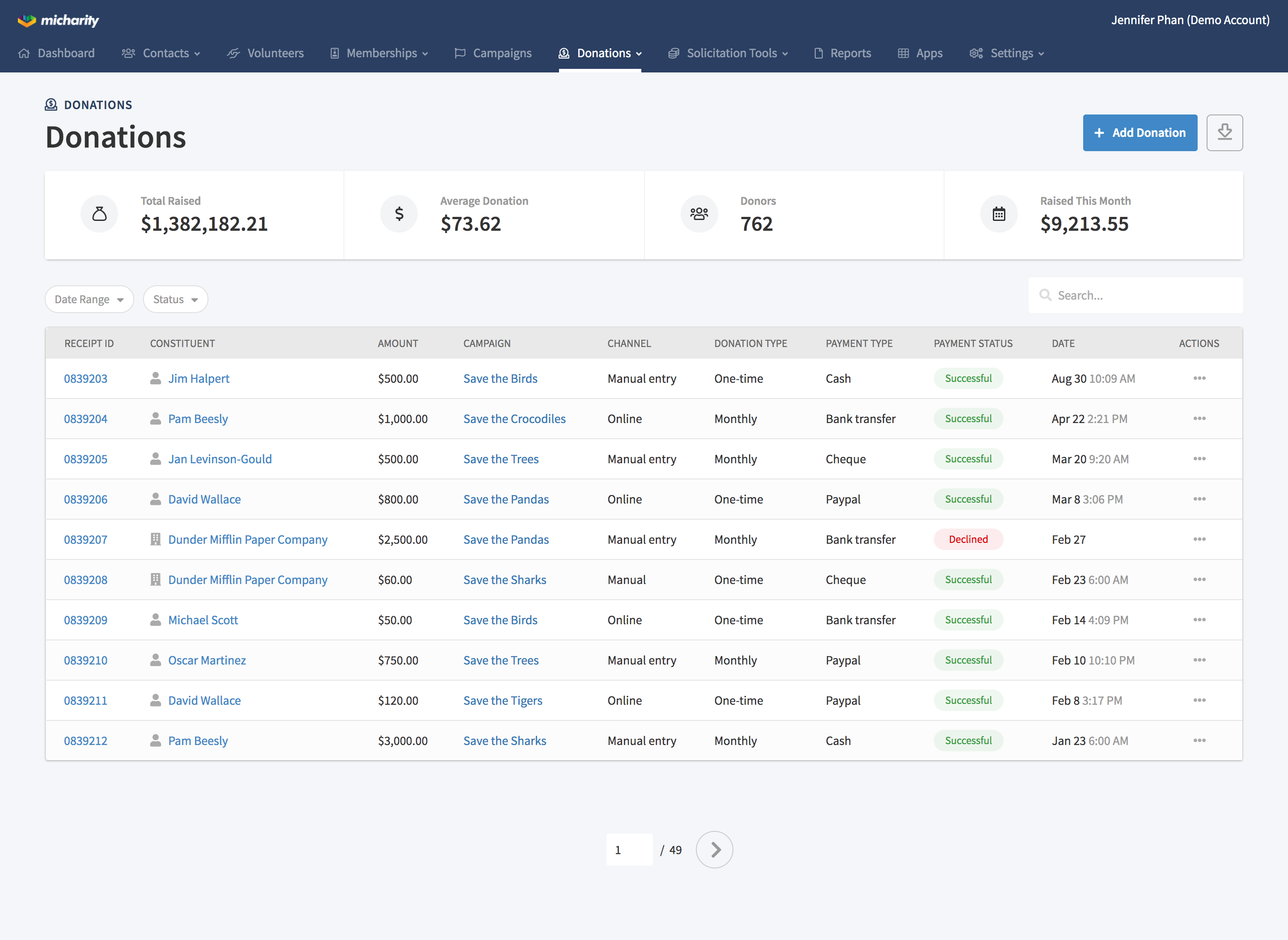
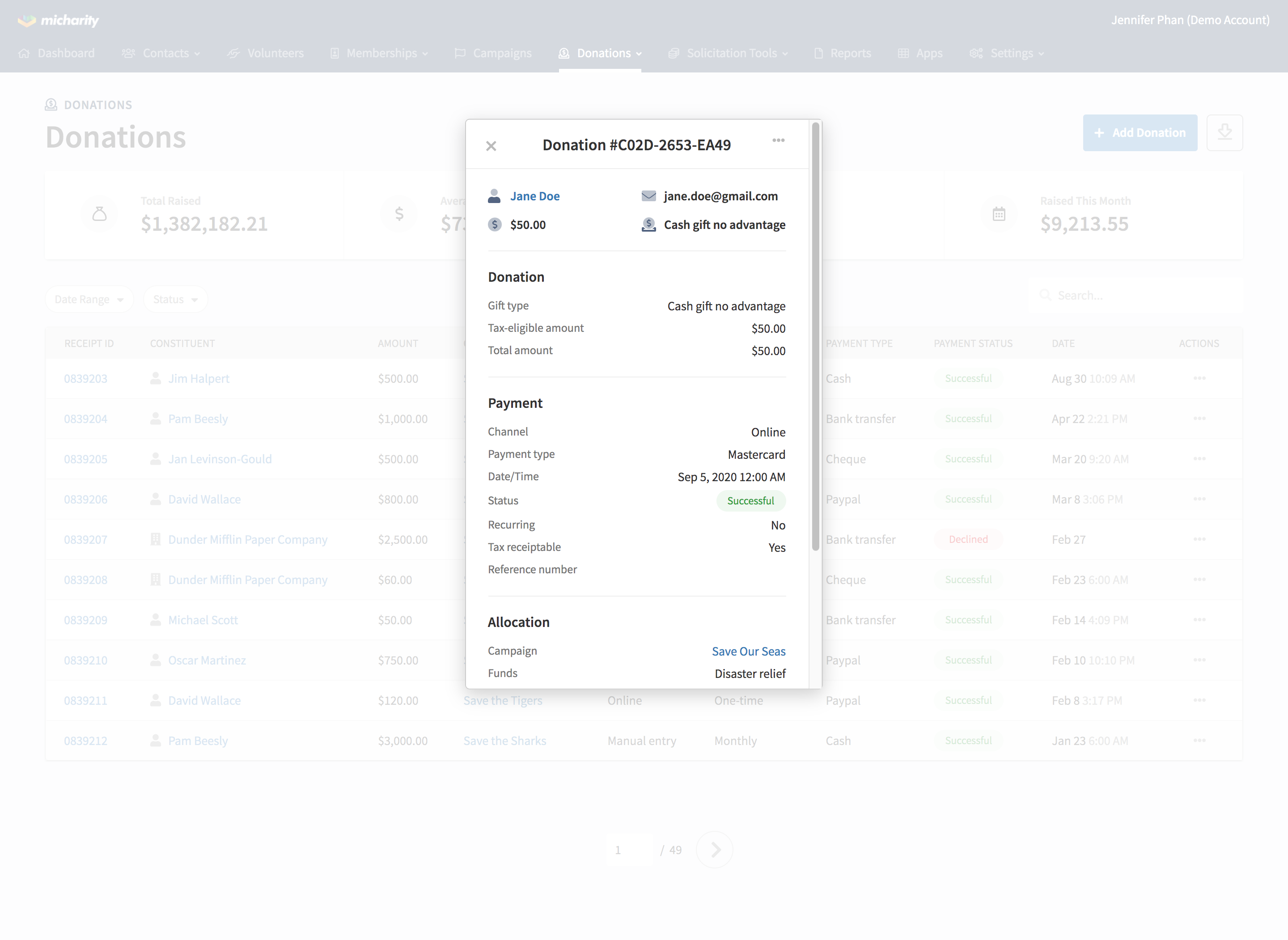
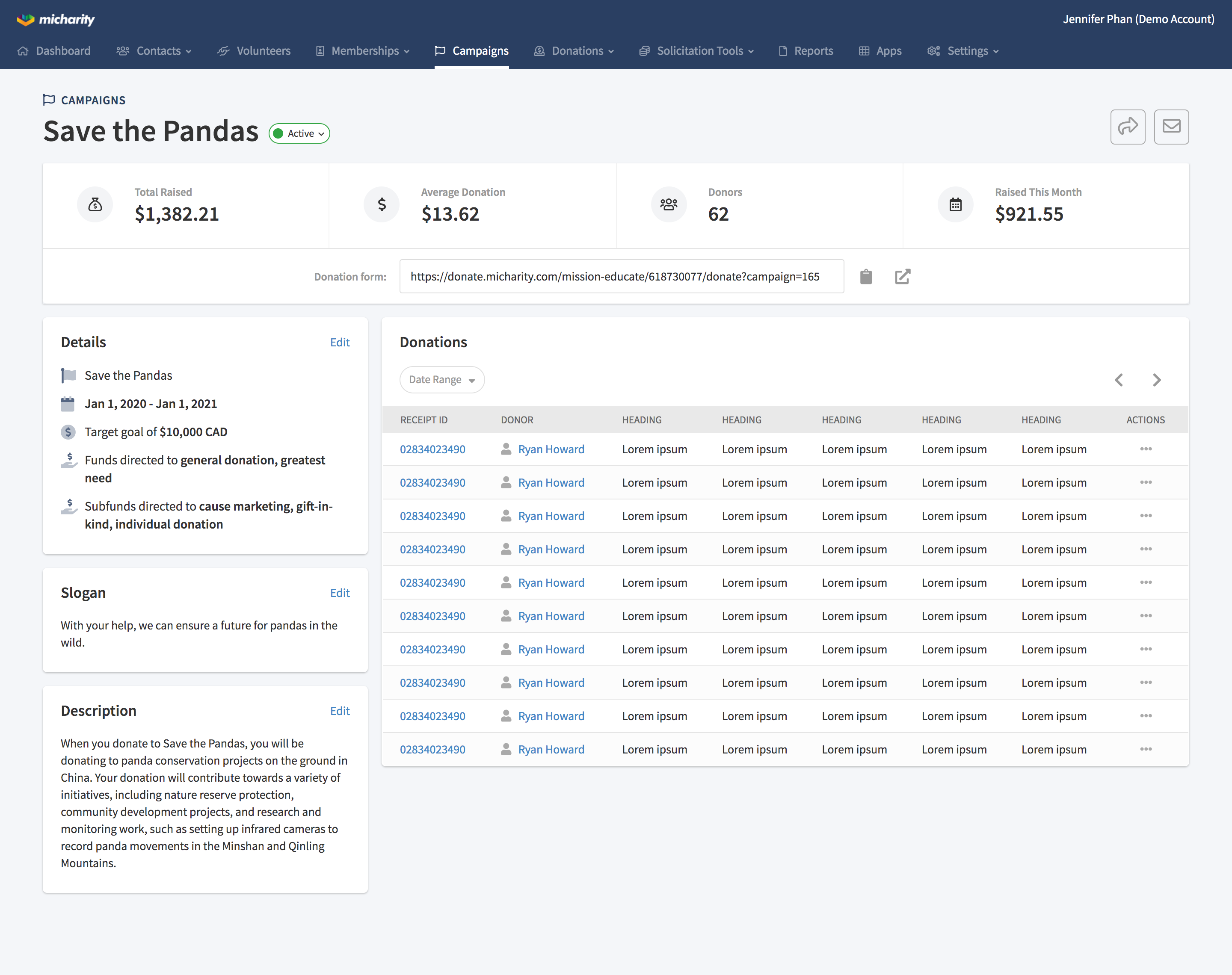
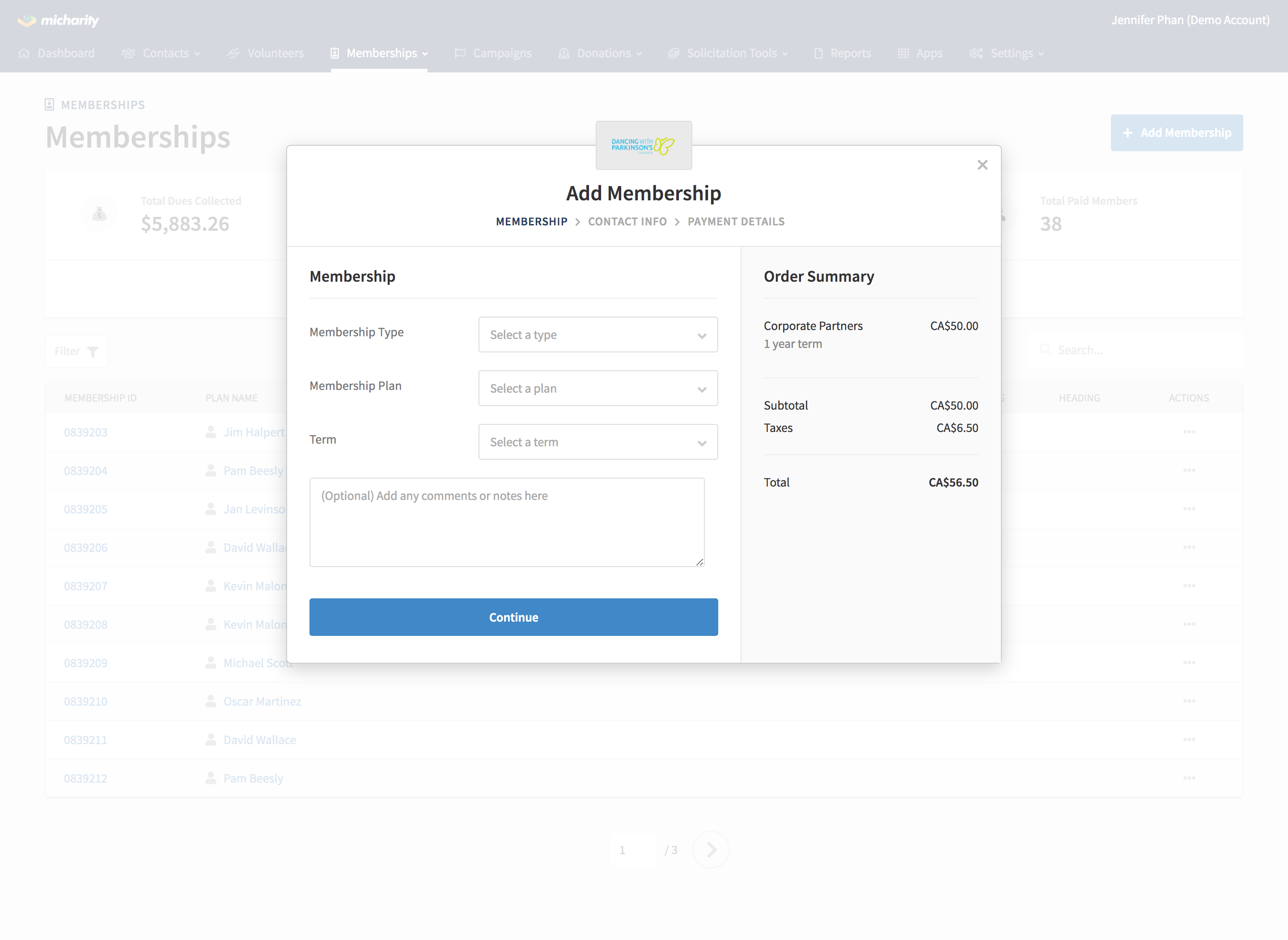
After the redesign of the platform sales growth increased by 15% compared to the previous year, lead-to-sale conversion increased, and customers reported feeling more satisfied with the product overall.